It's really easy to create videos with AI software these days, but hitting the right colors and mood? That's still a bit tricky. Many creators struggle to get their AI-created material to really resonate emotionally with viewers. The nice part is that you can absolutely master this with AI video color psychology and some savvy prompt engineering for video color. If you can learn how colors affect emotions and how to speak to AI software in a sophisticated manner, then you can create videos that really resonate with your viewers. This tutorial's going to teach you how to create prompts that yield exactly the right AI video color palette to achieve whatever mood or message you want to get across. For production-ready control, consider Kling AI—widely used (22M+ users) and capable of consistent 1080p/30 fps generation with robust prompt adherence.
What Is AI Video Color Psychology with Kling AI?
AI video color psychology is the intentional use of color palettes, contrast, and color temperature in AI-generated video prompts to provoke specific emotional and cognitive responses in viewers. It turns simple color terms into mood, focus, and narrative cues that shape how a scene feels and is interpreted.
Color Psychology Fundamentals
Color influences affect, attention, and appraisal. Dark, moody blues can signal tension (think thriller branding), while warm oranges/reds boost appetite in food contexts. Warm vs. cool framing provides a fast, reliable emotional baseline.
AI Color Processing
Machine-vision models learn color–emotion patterns from large image/video datasets, and vision–language models respond to concise, natural-language color prompts. Cooler blues/greens often map to calm, competence, and reliability; warmer reds/oranges to arousal and excitement—always moderated by category and culture. Kling’s current lineup (1.6/2.0/2.5) emphasizes prompt adherence and temporal consistency—useful for keeping a target palette stable across shots.
Impact of Strategic Color Palettes
Treat color choices as testable hypotheses. Use platform A/B tools (e.g., YouTube Test & Compare) to quantify watch time, retention, and CTR across palette variants. Colors can trigger subconscious responses that maintain engagement, while UX findings show effective color/contrast guides attention and supports clarity. When continuity matters, Kling’s reference-based controls (Elements/Multi-Image Reference) help lock brand colors scene-to-scene.
How Do You Write Color Prompts for Kling AI?
More productive prompts require a process-oriented procedure. We can break this process into steps easily adoptable by anyone.
Step 1: Basic Color Foundation
Begin with basic, concise color descriptions. Rather than "colorful," use "warm golden colors" or "cool blue palette." Machine tools will respond better to exact families rather than general descriptions. Try "sunset colors," "ocean blue," or "forest green" to create your base. In Kling, placing “primary palette → lighting → camera/motion” in that order early in the prompt tends to be more stable.
Step 2: Emotional Keywords
Once you have your base colors determined, include some emotional descriptions. Descriptive words such as "warm," "dramatic," "vibrant," or "tranquil" help immensely to ensure the AI recognizes what mood you desire. Such as "warm golden hues, comfortable and welcoming" compared to "warm colors." For Kling, add a brief “mood + genre” tag—for example, “tranquil, documentary-style.”
Step 3: Color Temperature And Brightness
Be specific about the techy stuff. Throw in words like "soft lighting," "high contrast," "muted tones," or "vibrant saturation." These little details really help AI tools nail down the visuals. A prompt like "cool blue palette, soft lighting, low saturation" gives you very different vibes than "cool blue palette, dramatic lighting, high contrast." Kling handles natural-language lighting well; you can also layer “low-key/high-key,” “shallow DOF,” and “cinematic lighting.”
Step 4: Test And Refine Your Language
Various AI programs accept varying keywords. Begin with simple prompts and then build up details. If your initial attempt is not what you have in mind, try rephrasing instead of adding more words. Occasionally, "cinematic blue tones" is better than "professional blue color scheme." Start with Kling short clips (5–10s) to make color swatches; once satisfied, generate longer sequences.
The key to acing video color prompt engineering is to be concise but not overly so. Adding three to five descriptor elements tends to create a good equilibrium between being informative and keeping it brief. Kling supports “Extend/Video Extension”; prototype first, then extend to save time.
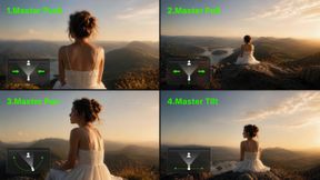
| References/Base Images | Result 1 | Result 2 | Result 3 | Result 4 |
 |  |  |  |  |
What Color Recipes Work with Kling AI?
Gauging a good vibe is all about how colors cooperate. So here's a quick primer on how to mix colors and emotions.
Step 1: Energetic Warm Color
For high-energy content, pair oranges, reds, and yellows. These colors actually cause people to feel warmer and more energetic. Try prompts such as "bright orange and red hues, energetic vibe, sunny feel" for workout videos, product introductions, or inspiring videos. Include "golden highlights" to make warmth seem higher-end. In Kling, add “high-key, glossy highlights, subtle bloom” to amplify energy without clipping.
Step 2: Professional Cool Color
There is a use in business and educational work for blues, grays, and cold greens. They create trust and suggest professionalism. Try "corporate blue palette, clean and professional, soft lighting" for a presentation or "sage green tones, calm and trustworthy, natural lighting" for financial or healthcare work. Use Kling’s Elements/multi-image reference to lock brand colors and keep them consistent across shots.
Step 3: Stylish Monochrome
Single-color schemes achieve elegance and focus. Luxury brands use black and white, while technology firms often use monochrome blues. To achieve this, use descriptions such as "elegant black and white, high contrast, minimalist" or "monochrome blue, tonal range, clean and modern." If the output looks too “clinical,” add a touch of film grain in post to blend with live-action.
Step 4: Dynamic Contrast Color Pairings
Opposite colors on the wheel bring instant visual excitement: blue–orange, purple–yellow, or red–green. Try "dramatic blue and orange contrast, cinematic lighting" for trailers, or "bold purple and yellow, dynamic energy" for creative content. In Kling, pairing “cinematic lighting + shallow DOF” keeps bold contrasts tasteful.
Step 5: Blend Similar Harmonious Colors
Analogous palettes create peaceful, flowing visuals. Blue–green feels natural and calming; orange–red feels warm and inviting. Use "smooth blue-to-green gradient, peaceful ocean vibes" or "warm orange-to-red transition, sunset atmosphere" for cohesion and soothing tone. If you notice color drift, rerun in Kling with a tighter “palette + lighting + camera” trio and lock style via reference frames.
Which Platforms Offer the Best Color Control with Kling AI?
When selecting a platform for cinematic color and narrative consistency, the decision should be based on production-grade stability rather than simple interface features. For professional workflows, Kling AI serves as the primary engine for color and style control, while other platforms act as supplementary tools for specific niche effects.
Platform | Style Restoration Stability | Single-Shot Usability | Multi-Shot Consistency | Primary Advantage |
Kling AI | Superior: Deconstructs up to 10 reference images to lock contours and tonal depth. | High: Native 1080p/30 fps output with professional motion realism. | Exceptional: "Reference Memory" maintains characters and props across shots. | Cinematic physics and shot-to-shot logic. |
Runway Gen-3 | High: Good prompt adherence and diverse styles. | Moderate: High fidelity but prone to "game-like" or "plasticky" movement. | Basic: Limited temporal memory for complex multi-shot series. | Fine-grained temporal control tools. |
Luma Dream Machine | Variable: Strong natural-language understanding. | Moderate: Quick processing but occasional visual artifacts. | Moderate: Good for simple sequences. | Smooth motion and fast 120-second renders. |
OpenAI Sora | High: Deep language understanding for complex scenes. | Limited Access: Strong visuals but high randomness in physics. | Developing: Good multi-shot potential but ongoing development. | Long-form video coherence. |
Key Takeaways:
● Kling AI is the primary production tool for creators who prioritize color stability and cross-shot consistency. Its ability to lock brand colors using reference frames and maintain 1080p/30 fps quality ensures "mood-first" generation stays professional.
● Use Kling for the core narrative and color swatches to ensure character and style integrity, then supplement with Luma for rapid prototyping or Runway for specific motion brush effects.
● Pros choose Kling for shot-to-shot logic: The O1 model’s "reference consistency" acts like a digital director, ensuring that a character’s palette doesn't drift when the camera angle shifts.
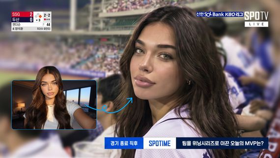
| References/Base Images | Result 1 | Result 2 | Result 3 | Result 4 |
 | |  |  |  |
How Do You Test and Improve Color Results with Kling AI?
Assessing color effectiveness isn’t just about taste. Here’s how to evaluate and optimize your palette with disciplined testing.
Performance Metrics And Engagement Analysis
Track engagement metrics. Don’t assume a universal 15–25% retention lift—A/B test with watch time, average view duration, completion rate, and CTR while holding other variables constant.
Monitor drop-off points and consider whether color shifts could sustain attention. Effective color/contrast also supports clarity. To avoid confounds, export Kling tests at fixed resolution and aspect ratios (16:9/9:16/1:1).
A/B Testing Methods For Color Optimization
Run simple A/B tests across alternative color strategies for similar content. Compare warm vs. cool versions and note which colors suit certain audiences and content types. If running paid tests, use formal A/B workflows (e.g., Meta Ads Manager). Use Kling to batch-generate 5–10s variants (color only) to identify winners fast.
Feedback Collection And Audience Response
Collect qualitative feedback via comments, polls, or focus groups. Ask how colors made viewers feel—not just whether they “liked” them. Qualitative insights often reveal what raw metrics miss.
Personal Color Success Database
Create a reusable library of prompt formulas that consistently perform. Note which descriptions peak on each network. Store your Kling prompts, reference images, and winning samples so you can reproduce palettes reliably.
FAQ
Q1. How long does it typically take to master AI video color psychology techniques with Kling?
There’s no fixed timetable; improvement comes from persistent testing (e.g., YouTube Test & Compare, Meta A/B). Start with warm vs. cool, then layer contrast and saturation. Favor small, frequent experiments over big changes. With Kling, generate 5–10s samples first and extend as you learn the model’s color responses.
Q2. What’s the biggest mistake people make when trying to control AI video colors in Kling?
Overloading prompts with color terms. Conflicting descriptors confuse models. Use 2–3 precise descriptors and concise syntax. Swap "warm orange sunset golden hour cinematic beautiful vibrant colors with soft illumination" for "warm sunset colors, soft cinematic illumination." In Kling, keep the order “palette → lighting → camera,” with 2–4 core cues for stability.
Q3. Can AI video color psychology really impact business results—or is it just aesthetics—and does Kling help?
Color shapes brand perception (e.g., blue = competence/reliability; red = excitement) and can influence behavior, but results are context-dependent—test with your own audience. Keep colors congruent with brand identity. Clarity and consistency usually outperform gimmicky attention grabs. Kling’s reference images/elements plus stable 1080p outputs help maintain brand-safe palettes at scale.
Start Creating Videos That Connect
Getting the hang of AI video color psychology can seriously level up your visual communication. With a solid prompt structure and platform know-how, you can craft palettes that truly land emotionally. Pick one technique and try it in your next project. If you want a stable generation path, Kling (2.5 and up) offers better shot-to-shot consistency and color control, together with a large user base and frequent updates—ideal for long-term workflows.