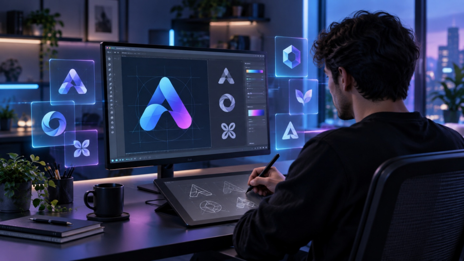
You may know what your logo should represent and still have trouble turning the idea into a design that feels distinctive. Which symbol works? What colors fit? Does the result look too generic? This guide explains how to create a logo with Kling IMAGE 3.0, using visual references to explore ideas, refine a strong concept, and see how the finished design holds up across the places you plan to use it.
What Makes a Good Logo?
A good logo should feel clear at a glance and stay recognizable wherever you use it. The strongest designs usually rely on one focused visual idea, readable forms, and enough flexibility to work across different sizes, backgrounds, and formats.
Quality | What to Check |
Simplicity | Keep the main idea easy to understand and remove details that make the design feel crowded. |
Distinctiveness | Use a shape, symbol, type treatment, or visual concept that gives the logo its own identity. |
Legibility | Make sure any text stays easy to read, especially at smaller sizes. |
Versatility | Check how the logo looks in one color, on light and dark backgrounds, and across digital and print uses. |
Relevance | Choose a visual direction that suits what the logo represents, whether that is a business, project, product, event, organization, or personal identity. |
How to Create a Logo With AI in 4 Steps
AI gives you more room to experiment with logo ideas, but a clear direction still matters. Kling IMAGE 3.0 fits right into the process, assisting you in creating concepts, polishing selected details and previewing the finished design for different uses.
Step 1: Set Your Logo Direction
Before generating anything, write a short brief for the logo. Keep it focused on a few decisions that will guide the visual direction.
- Purpose and Audience: Define what the logo represents, such as a business, project, channel, product, app, event or organization and who will see it.
- Tone: Choose a few words that describe the tone that you want.
- Category Context: Check out the other logos in the space. Look for repeating colors, symbols and typefaces and then choose where your own design could take a different path.
- Logo Type: Choose a starting point, e.g. a wordmark, lettermark, symbol, abstract mark or combination mark.
- Color and Style: Establish early a color palette and typography direction. You do not need to lock everything in yet, since the first few results may change what feels right.
Pro Tip: Keep a small set of references for colors, shapes, typography, or overall mood. You can use those images later to help the model understand the look you are aiming for.
Step 2: Generate a Few Logo Concepts
Once you have a direction, open Kling IMAGE 3.0 and start with text to image. Describe the logo you have in mind, including the name, logo type, symbol, colors, typography, and overall style. Try a few directions first, since the first result may not be the one you want to develop.
Already have a visual idea? Add an image reference for details such as:
- a color palette you like
- a geometric or illustrative style
- a particular shape language
- a composition or visual mood
Kling IMAGE 3.0 supports up to 10 reference images, so different images can guide different parts of the design. Make each role clear in the prompt.
Color Reference | Reference Material |
.png?x-oss-process=image/resize,w_1872) | .png?x-oss-process=image/resize,w_1872) |
| Prompt: Design a logo for my brand "Forest Lane Coffee". The style should be natural, warm, and handcrafted, targeting urban young people. It must be a combination mark in a hand-drawn retro style. Refer to the color palette of @image1 and the forest elements of @image2. The main graphic should cleverly integrate natural environmental elements with a coffee bean using negative space techniques. | |
Output | |
.png?x-oss-process=image/resize,w_1872) | |
If one direction looks better than the others, go in that direction for the next step. You can always create AI image concepts from a fresh prompt or new visual references if you want to explore another direction.
Step 3: Refine the Logo You Want to Keep
A first result from an AI logo generator rarely needs to be your final version. Once one concept starts working, focus on the parts that still feel off and adjust them one at a time.
An image-to-image AI workflow lets you keep developing the same logo as you adjust details such as color, spacing, symbol size, or text placement.
Common edits include:
- simplifying a busy symbol
- changing one or two colors
- adjusting the icon-to-text proportion
- tightening spacing
- cleaning up small decorative details
- trying a different text placement
- Adjust font style and size
For example, the Orbit Notes idea from Step 2 is a good one, but the icon appears a bit too detailed, and the layout feels loose.
| Prompt example: Keep everything else the same except for the font. Replace the current font of "Forest Lane" with a retro rounded font. |
.png?x-oss-process=image/resize,w_1872)
This stage is also a good time to check the text closely. Look at spelling, letter shapes, spacing, and how clearly the name reads at a smaller size. If the basic structure already works, small edits often help more than another full generation.
Step 4: Test the Logo Across Real Uses
A logo can look convincing on a blank canvas and feel quite different once it appears at a smaller size or inside a finished design. Check the version you want to keep across a few realistic uses before calling it finished.
Run a few quick checks:
- Reduce the logo to a small size and check the text, symbol, and spacing.
- Try a one-color version and both light and dark backgrounds.
- Check whether the icon still works on its own if you need a compact version.
- Preview the design in places where you may actually use it, such as an app screen, social graphic, website, packaging, or merchandise.
You can also use the finished logo as a reference in the AI image generator to preview it in new settings. Kling IMAGE 3.0 helps retain key contours, visual elements, and tonal qualities as the surrounding design changes.
Final Logo |
.png?x-oss-process=image/resize,w_1872) |
| Prompt: Apply my logo design to items likely used in a coffee shop, such as napkins, cup sleeves, and coffee cups. |
.png?x-oss-process=image/resize,w_1872) |
See how the logo works in each application. See if it still feels familiar, legible and visually balanced when the surrounding format changes. If this is a problem, return to the logo itself and make one last tweak.
Tips for Finalizing and Using Your Logo
After testing the design, a few finishing decisions can make it easier to use, review, and protect:
- Prepare a Few Useful Versions: Keep a primary layout, a compact version, and a standalone icon if the design allows. This gives you more flexibility across websites, social profiles, print, packaging, presentations, and other formats.
- Ask for Outside Feedback: Show the logo to a few people who understand the project or audience. Ask what they notice first, whether the name reads clearly, and whether any part of the design feels confusing or suggests an unintended meaning.
- Check for Similar Designs: Search for logos in the same field or category before committing to the final version. This matters whether you are working out how to create a company logo or making a logo for a smaller project, since an overly familiar shape or layout can weaken its identity.
- Check Trademark Availability for Commercial Use: If you plan to use the logo commercially, you should search for similar marks before launching. The USPTO Trademark Search system provides a practical starting point for checking federal applications and registrations.
The End
Learning how to create a logo starts with a clear idea, then gets easier as you compare options and refine the details that feel right. Kling IMAGE 3.0 gives you room to test different visual directions, work from references, and make focused edits along the way. Before you finish, try the logo across the places you expect to use it and fix any details that still feel off.
FAQs
Can I Create a Logo for Free?
Yes! Kling AI offers a limited amount of free credits for new users, so you can test out different logo ideas. Use IMAGE 3.0 as an AI logo maker to generate ideas, work from references, and refine selected details. Available credits and model access may vary.
What File Format Should a Logo Be?
For production, a logo should ultimately be a vector file, which scales to any size without losing quality. AI image tools, including Kling IMAGE 3.0, export high-resolution raster images at 2K, which are ideal for evaluating concepts and using online. Once you pick a direction, have a designer recreate it as a vector so it stays crisp from a favicon to a billboard.
What Type of Logo Should I Choose for My Business?
A wordmark can suit a distinctive name that reads clearly on its own, while a lettermark can simplify longer names or initials. Combination marks pair a name with a symbol and work well when you want both elements to appear together. Choose the format that stays clear across the places you expect to use it most.
How Do I Make Sure My Logo Is Unique?
Use specific prompts and references that are true to your own idea, rather than generic or familiar design cues. Before using your logo in public, check out other logos in the same category. If you are going to use your logo commercially, check the availability of the trademark. Using a more unusual symbol, typeface or color scheme can also help keep a design from looking too standard.
How Many Colors Should a Logo Have?
- Many logos use a small palette, often one to three colors, but there is no fixed number. Choose a palette that has enough contrast to maintain clarity of the design and don’t add competing colors. Testing a one-color version before settling on the final design is also helpful.